3 minutes
Maps in Python
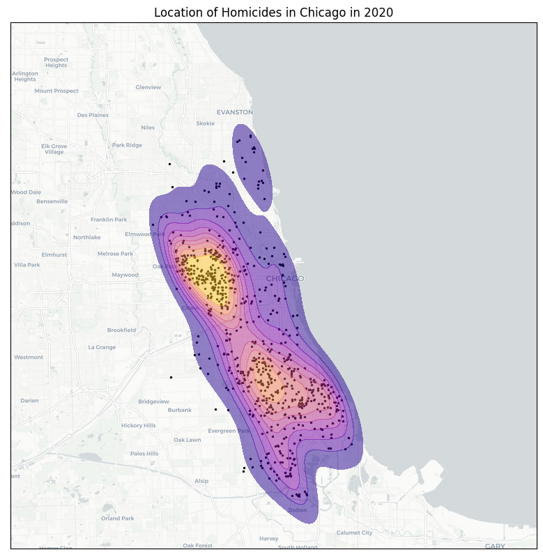
Density plot using TileMapBase
Below you will find a code snippet to make beautiful density maps in Python. This code uses the TileMapBase library and the public dataset of crimes in the city of Chicago in 2020.
You can adapt the code below by changing the center_point and map_size variables to set the center and size of the map, respectively, which correspond to your data.
import matplotlib.pyplot as plt
import seaborn as sns
import tilemapbase
import pandas as pd
# Crime data can be found here:
# https://data.cityofchicago.org/Public-Safety/Crimes-2020/qzdf-xmn8
crime = pd.read_csv("data/crimes.csv", index_col="ID")
# Create Map
tilemapbase.start_logging()
tilemapbase.init(create=True)
t = tilemapbase.tiles.build_OSM() # use OpenStreetMap
# Find latitude and longitude of center point for the map
center_point = (-87.640198, 41.867214) # WARNING: tuple must be in order (Longitude, Latitude)
map_size = 80 # km
# Compute degree range
# earth_circumference = 40000 km
map_size_degree_range = map_size / 40000 * 360
extent = tilemapbase.Extent.from_lonlat(center_point[0] - map_size_degree_range/2, center_point[0] + map_size_degree_range/2,
center_point[1] - map_size_degree_range/2, center_point[1] + map_size_degree_range/2)
extent = extent.to_aspect(1.0)
# Helper function to convert coordinates
def transform_coord(lon, lat):
"""
Convert longitude and latitude to web mercator
"""
coord = [tilemapbase.project(i,j) for i,j in zip(lon, lat)]
x, y = zip(*coord)
return x, y
### Map
# Set style of map
# List of all map styles can be found here:
# https://github.com/MatthewDaws/TileMapBase/blob/master/tilemapbase/tiles.py
t = tilemapbase.tiles.Carto_Light
# t = tilemapbase.tiles.Stamen_Watercolour
# t = tilemapbase.tiles.Carto_Dark
fig, ax = plt.subplots(figsize=(10,10), dpi=100)
ax.xaxis.set_visible(False)
ax.yaxis.set_visible(False)
plotter = tilemapbase.Plotter(extent, t, width=600)
plotter.plot(ax, t)
x, y = transform_coord(crime.loc[crime['Primary Type'] == "HOMICIDE", 'Longitude'], crime.loc[crime['Primary Type'] == "HOMICIDE", 'Latitude'])
density_plot = sns.kdeplot(x=x,
y=y,
fill=True,
alpha=0.5,
cmap="plasma",
zorder=3
)
ax.scatter(x, y, color="black", s=2)
ax.set_title("Location of Homicides in Chicago in 2020")
# Save map
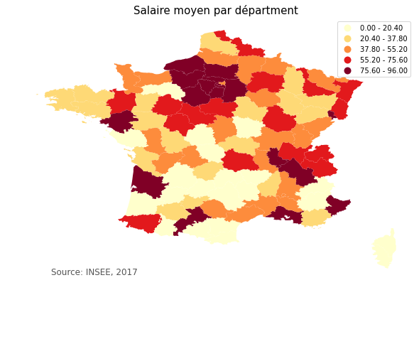
ax.figure.savefig('img/crime_chicago.png', bbox_inches='tight')Choropleth map using GeoPandas
For this section, we will plot the mean salary of French worker per département. The data can be found on the INSEE website, which is the French National Institute of Statistics. I voluntarily chose a dataset that is not "per country" so that we can show here the general method to plot any choropleth map using a GEOJSON file. The idea is to merge a dataset with the data per département on one side with a GEOJSON file describing the geometry of the département (so that geoPandas can draw it on the map). I found the GEOJSON data for the French départements here.
# Import data with value per département
import pandas as pd

salaire = pd.read_csv("data/salaire.csv")
salaire.head()

# Import GEOJSON with geographical data per département
import geopandas as gpd

france = gpd.read_file("data/France_departements.geojson")
france.head()

# Merge both datasets into one GeoDataFrame
france_map = salaire.merge(france,
                           left_on='Numéro Département',
                           right_on='code',
                           how='left')
france_map = gpd.GeoDataFrame(france_map)

# Plot
fig, ax = plt.subplots(1, figsize=(10,10))
# here we use quantiles with k=5: salaries will be split into 5 buckets, see legend for details
france_map.plot(ax=ax,
                column='Ensemble',
                cmap='YlOrRd',
                scheme='quantiles',
                k=5,
                legend=True)

ax.axis('off')
plt.title("Salaire moyen par départment", fontsize=15)
# create an annotation for the data source
ax.annotate('Source: INSEE, 2017', xy=(0.1, .15),
                                   xycoords='figure fraction',
                                   horizontalalignment='left',
                                   verticalalignment='top',
                                   fontsize=12,
                                   color='#555555')
# plt.savefig("data/france_salaire.png", bbox_inches='tight')
plt.show()
Interactive map using Plotly
GeoPandas maps are nice, but they are static. Here we use Plotly to plot a map of the 2020 US election by county. At the time of writing, the data used to create this map was publicly available here.
from urllib.request import urlopen
import json
import pandas as pd
import plotly.express as px
# Two lines below are necessary if running in a Jupyter notebook
from plotly.offline import init_notebook_mode
init_notebook_mode()

# Download county polygon data
with urlopen('https://raw.githubusercontent.com/plotly/datasets/master/geojson-counties-fips.json') as response:
    counties = json.load(response)

# Download county election data
df = pd.read_csv("https://raw.githubusercontent.com/tonmcg/US_County_Level_Election_Results_08-20/master/2020_US_County_Level_Presidential_Results.csv", dtype={"fips": str})

# Plot interactive map
fig = px.choropleth(df, geojson=counties,
                        locations='county_fips',
                        color='per_dem',
                        color_continuous_scale="rdbu",
                        range_color=(0, 1),
                        scope="usa",
                        labels={'per_dem':'Democrat percentage'}
                        )
fig.update_layout(margin={"r":0,"t":0,"l":0,"b":0})
fig.show()
# fig.write_json("us_map.json")